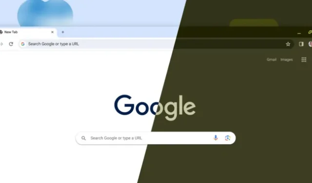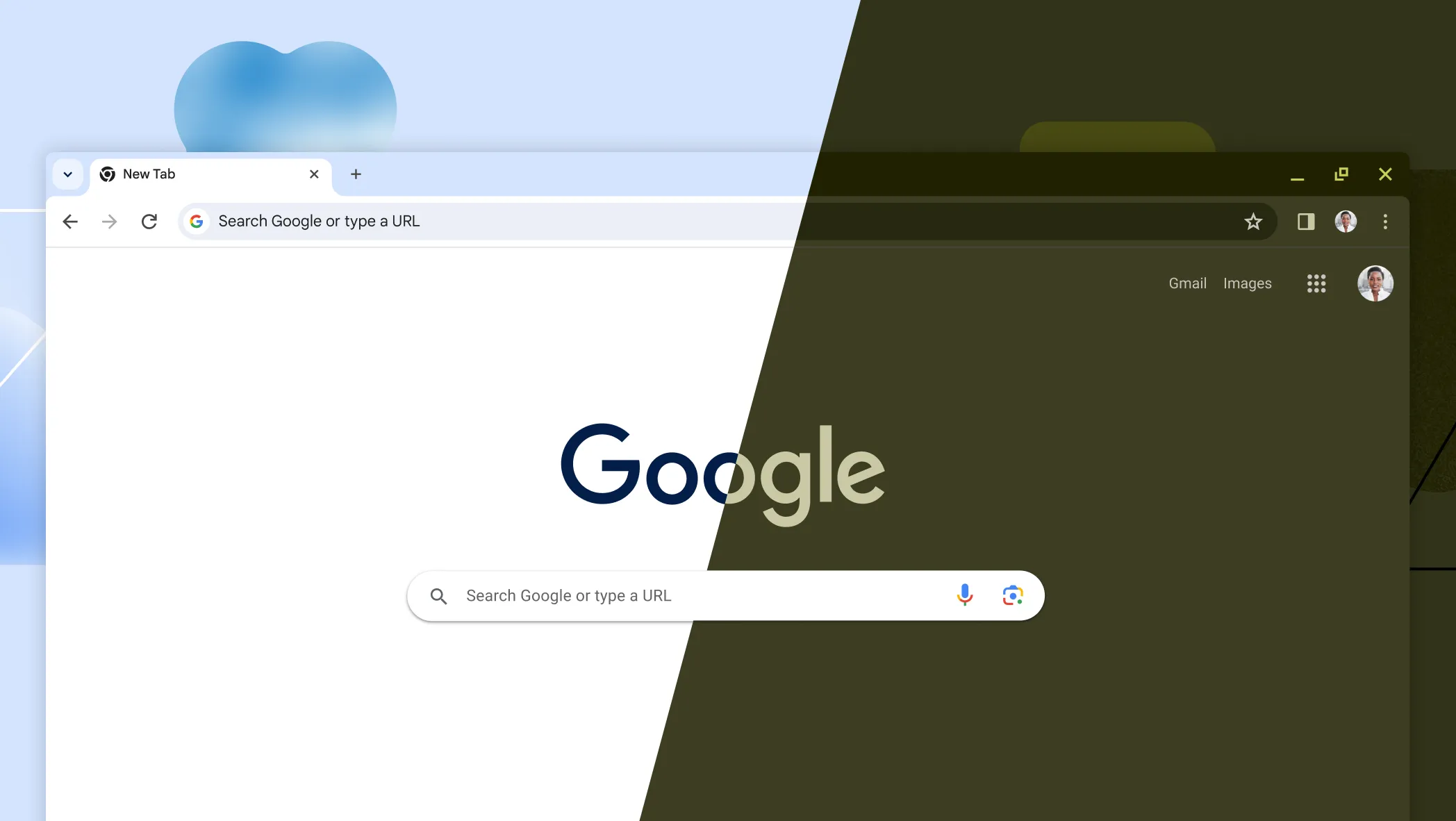

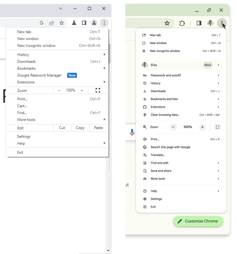
It’s Chrome’s 15th birthday, and the browser is getting a big redesign to celebrate, or at least, it’s as big of a redesign as you can do on a big, empty window to the Internet. Google’s “Material You”design language is finally coming to Chrome stable (after some experiments in the past), and that means lots of rounded corners and pastel colors.
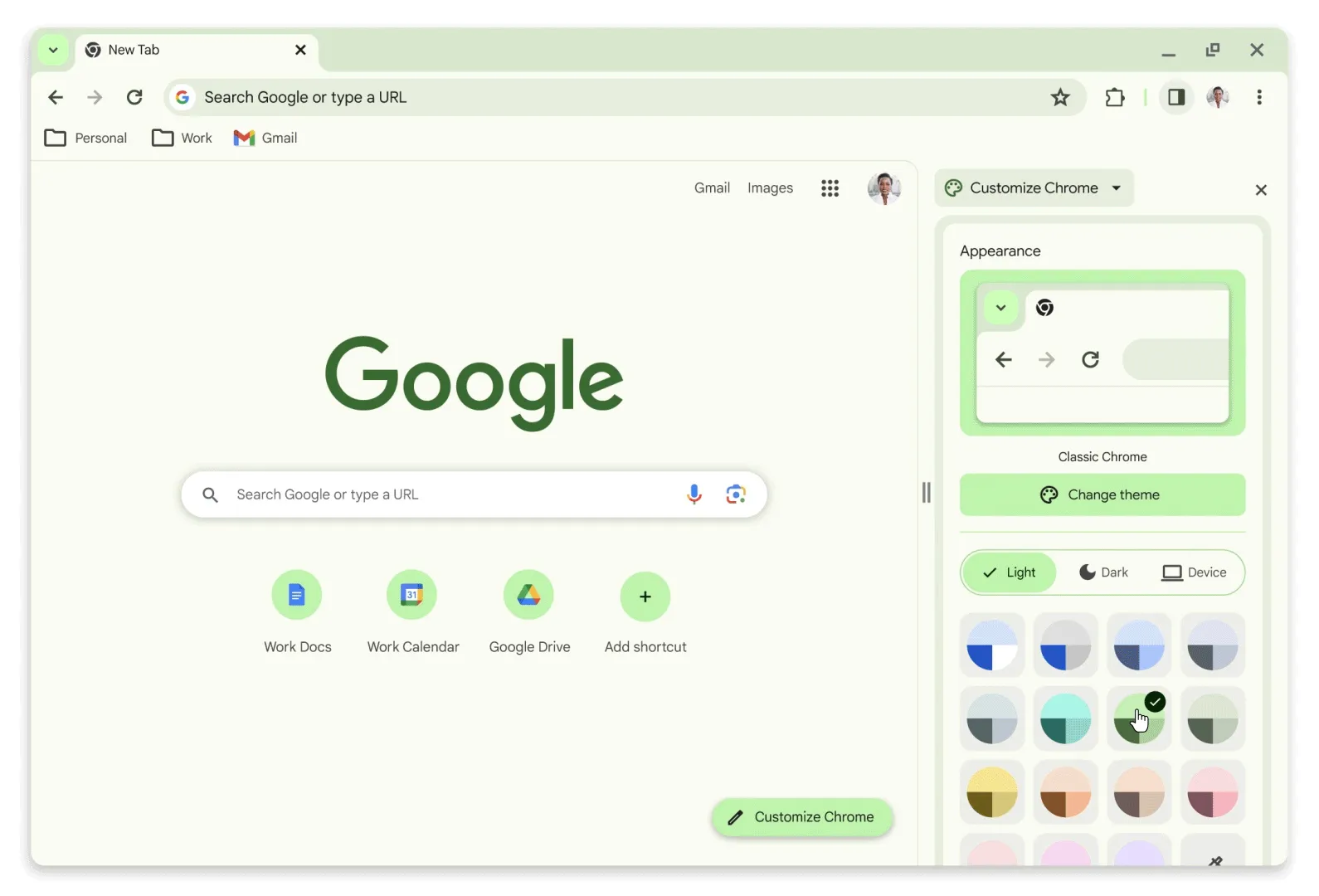
There has long been a “customize Chrome”button on the new tab page, but now when you open it you’ll get a selection of Material You color swatches that look like they were ripped right out of Android. There is still a white theme if you want to ignore all that, though the default color now seems to be back to blue instead of gray, just like the early versions of Chrome. As previously promised, the SSL lock icon in the address bar has been replaced by a settings switch. The “Down arrow”tab menu has been moved to the left side of the browser (on Windows, at least). All of the text and icon line work has been tweaked to be thicker, and some things, like the bookmark folders, have totally new icons.
Everything has been rounded over. The top left and right corners of the toolbar are now rounded corners. The menu is rounded. The tab corners are even more rounded than they were before. And the Chrome window in the screenshots isn’t even using the native OS UI—it’s a totally custom window so that even the corners of the browser window can be rounded over. There isn’t a single sharp edge on this thing.
Google also promises a “more comprehensive menu,”and that means it’s a lot longer now. New entries include a profile switcher, a whole flyout menu for “passwords and autofill,”a link to clear browsing data, a “search this page with Google”button, a translate listing, a flyout menu for “find and edit,”and a new “save and share”listing that is also a sub-menu of some kind. Between Search, Translate, Share, and Passwords, it feels like a lot more Google services are being pushed.
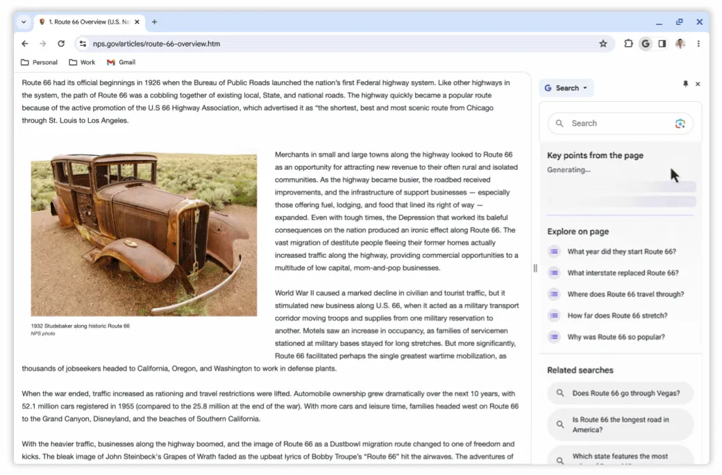
Chrome is really in love with the idea of sidebars lately, and a new Google “G”button in the toolbar will open Google Search in the sidebar. This is also available from the right-click menu. Of course, in the Google era of “Mandatory AI,”you can also fire up Google Bard in the sidebar and get a page summary.
Google also says it’s upgrading Chrome’s “Safe Browsing”blocklist. Previously it was updated every 30 to 60 minutes, but now all your sites will be scanned in real time. That doesn’t sound great for privacy, but Google is already getting all your site data from things like syncing, auto complete, address bar suggestions, search, and every other thing you do in Chrome.
Google’s blog post doesn’t mention when any of this is coming out, only saying to “look out for more updates ahead.”
