With the impending launch of Vision Pro and visionOS, it might look like iOS and iPadOS aren’t Apple’s main focus right now. Nevertheless, this year’s update promises some notable additions—even if some won’t be available until weeks or months down the line.
There’s one major new feature that’s available right away—StandBy, which turns your phone into a smart display. Core communications apps like Messages, Phone, and FaceTime are cornerstones of this update, too, along with new ways to use AirDrop. And as usual, Apple has introduced some new AI-powered features, including improved autocorrect and typing suggestions.
Meanwhile, the iPad got some key features from last year’s iPhone software update, plus improvements to the controversial Stage Manager multitasking view.
Several planned features, like a new journaling app, didn’t make it in this initial launch, but Apple plans to roll them out in smaller updates during iOS 17’s yearlong cycle.
Even though this isn’t one of the more dramatic iOS annual updates, there’s still plenty to talk about. Let’s start with StandBy.
StandBy
While there are several app-specific additions throughout iOS 17, the headlining new feature is StandBy, which turns your phone into a sort of smart display or digital clock on your nightstand. It’s on by default, and it activates when you connect your iPhone to a power source and leave it still in a landscape orientation.
Given leaks and rumors about a HomePod-with-smart-display over the past couple of years, it’s hard not to see this feature as a peek at a future product. It probably is, but it’s also a nice addition for iPhone owners, even if it’s not an essential one.
You might remember the multi-year craze at CES of Google Assistant and Amazon Alexa smart displays. Those products found their niche, but they were clearly overhyped. Regardless, that’s basically what this is, but it runs right on your iPhone without the need for additional hardware—and it’s Siri instead of those two arguably more useful voice assistants.
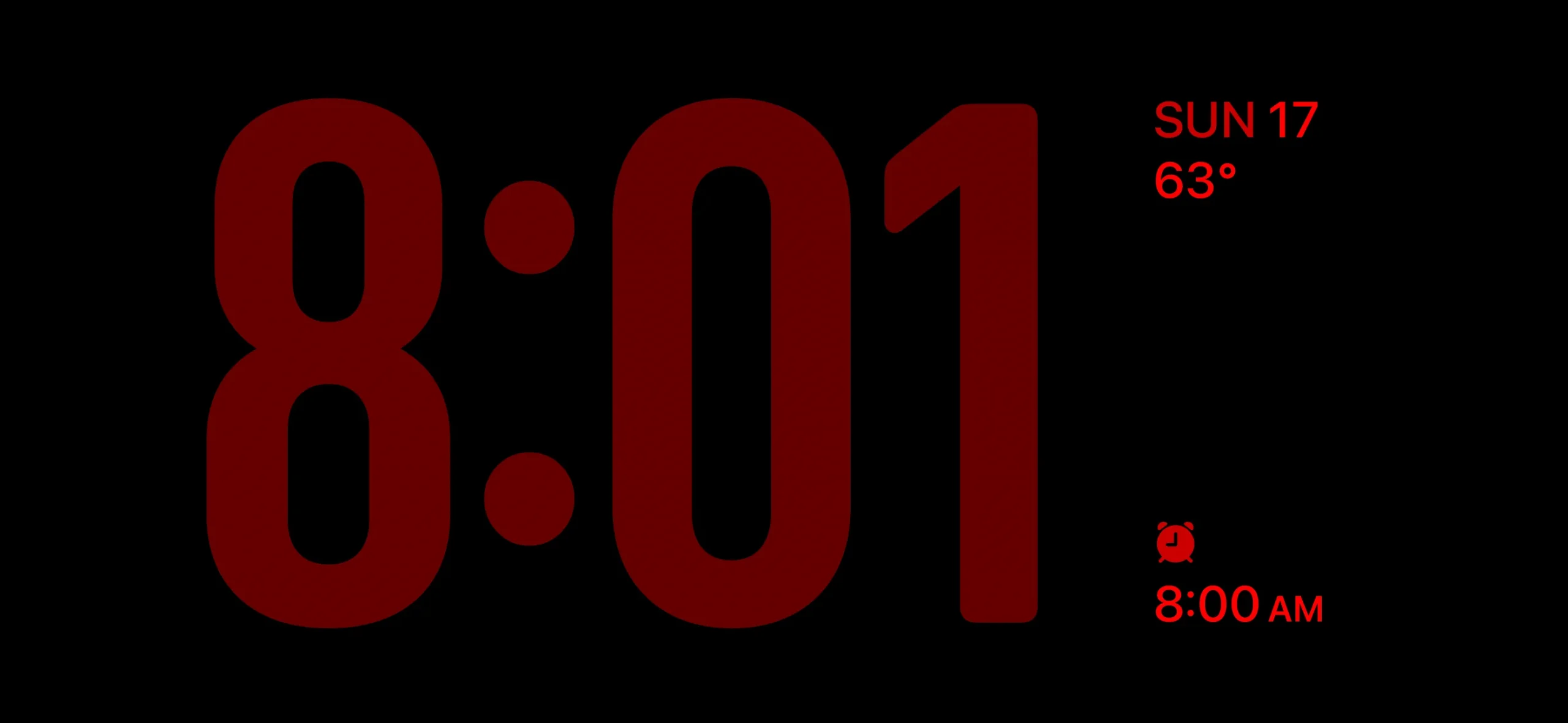
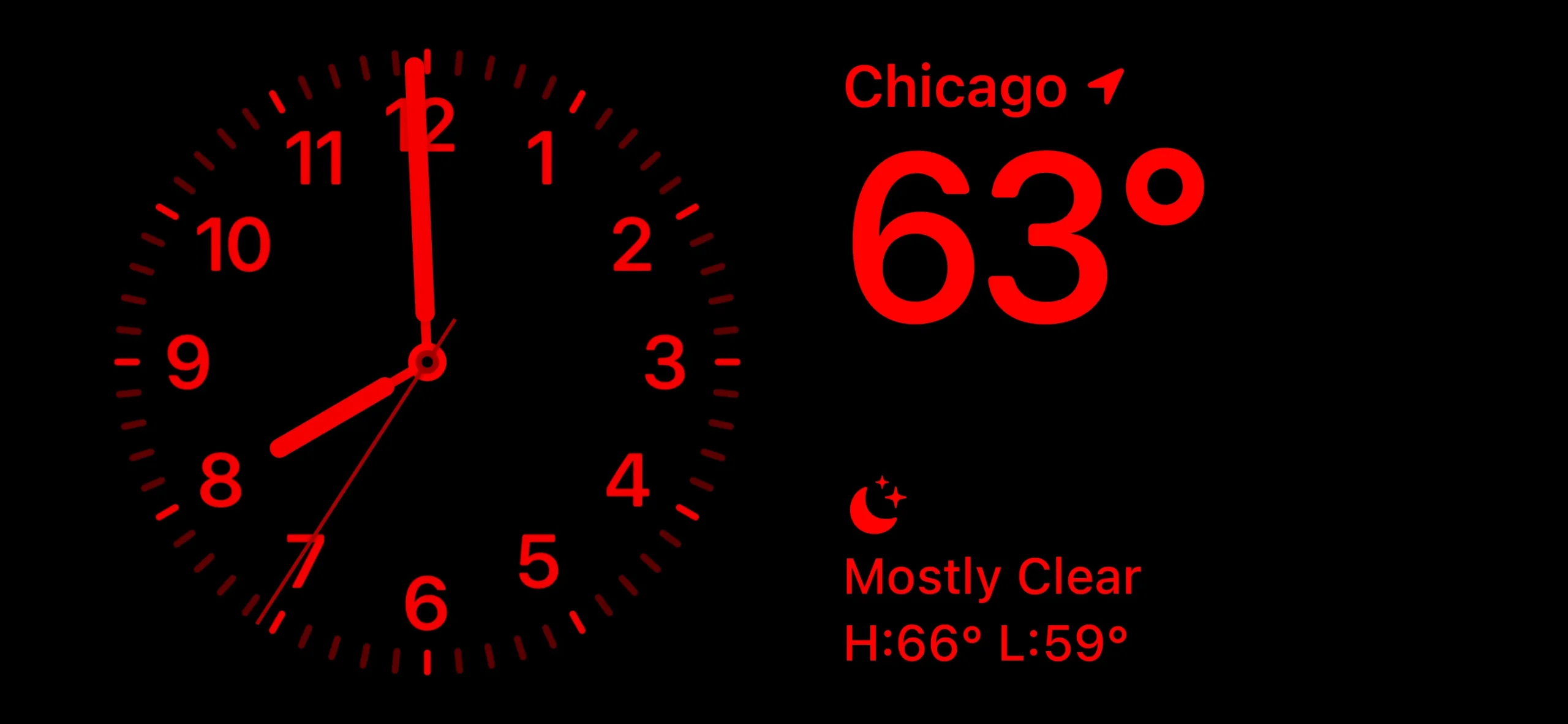
You can choose between two viewing modes for StandBy in the Settings app. The default one is a low-brightness full-color option akin to the default behavior of the iPhone 14 Pro and iPhone 15 Pro’s always-on home screen. There’s also a night mode, which brings the brightness way down for a two-tone, red-text-on-a-black-background look that reminds me uncannily of Nintendo’s ill-fated Virtual Boy. I’d pick the night mode option if I put an iPhone in StandBy mode by my bed at night; the other one is too bright and distracting and is more suitable for an office desk or the kitchen counter.
Widgets, Photos, and Clock
StandBy takes over your phone’s entire screen when it activates, and it’s split into three distinct pages: widgets, photos, and clock.
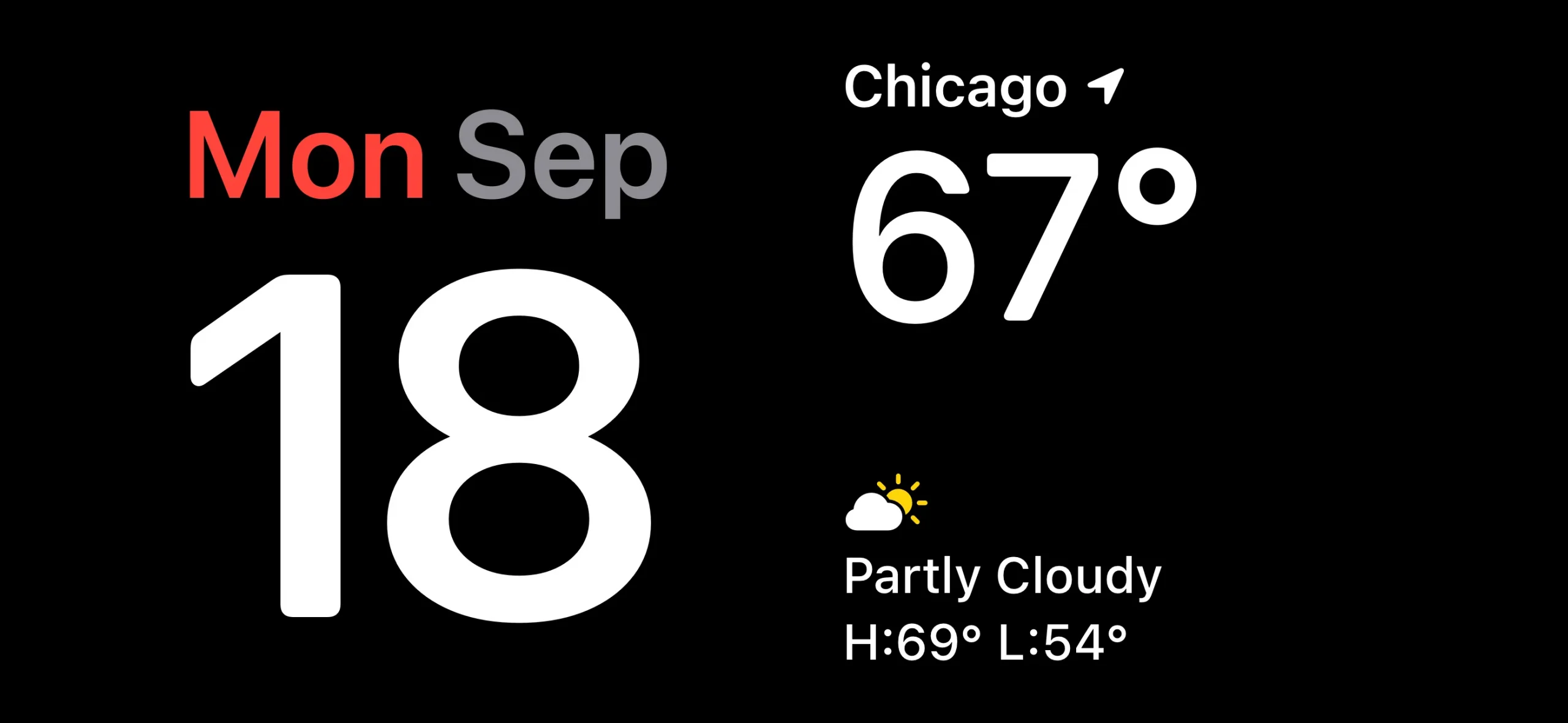
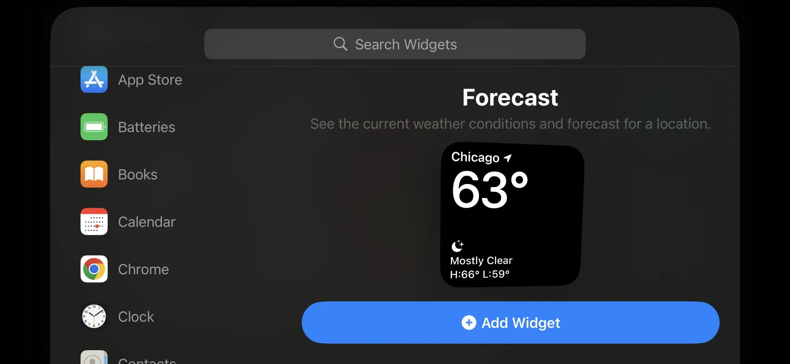
The first of those shows two side-by-side app widgets, each of which takes up wholly half of the screen. The designs and functionality of these widgets are similar to small, 2×2 home screen widgets.
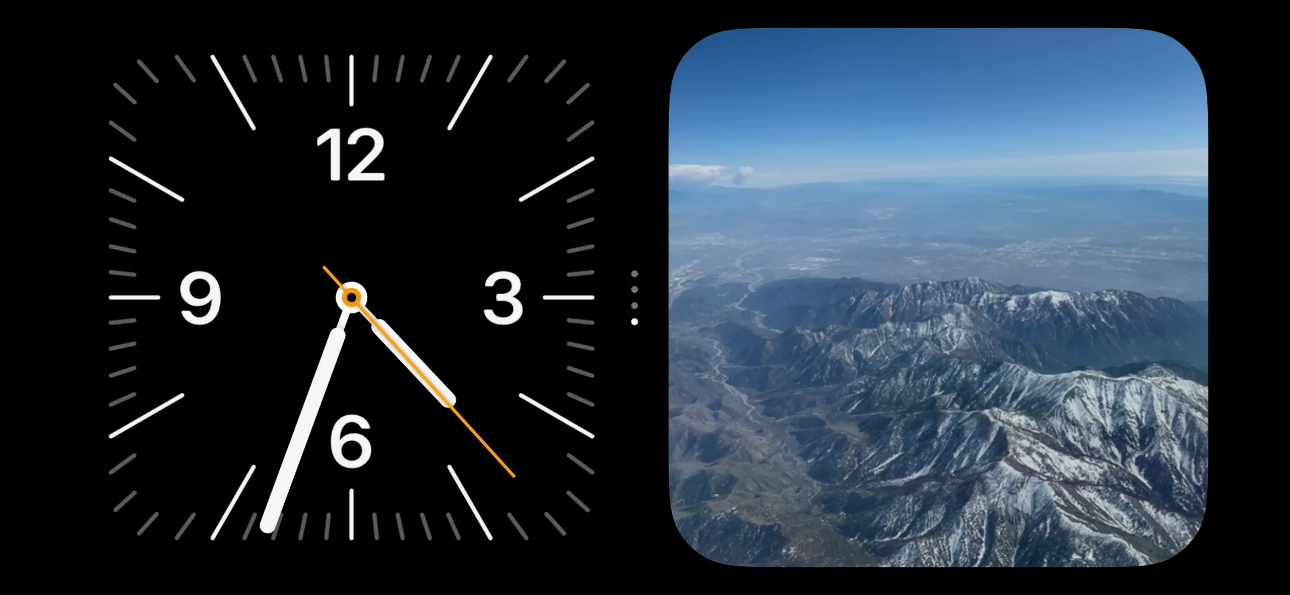
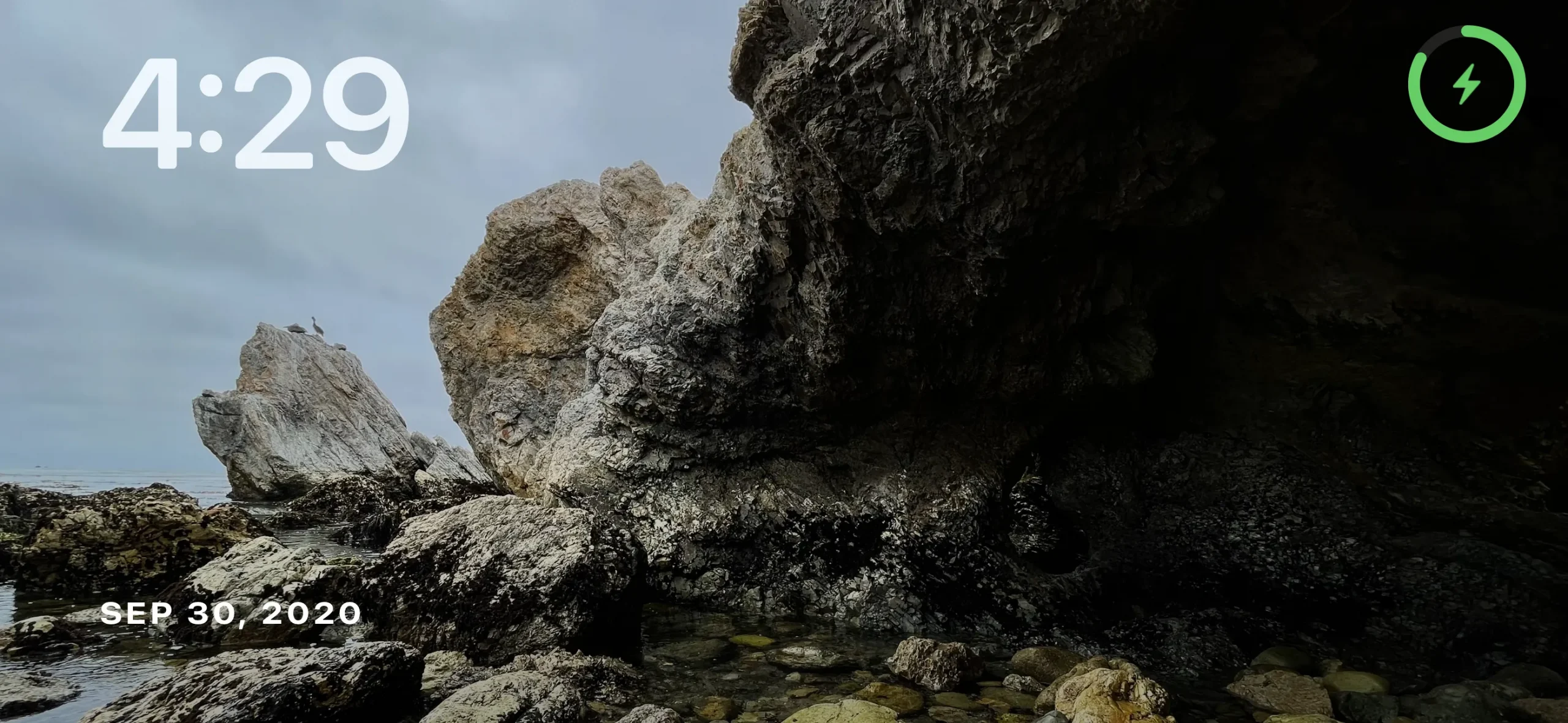
Photos serves up full-screen images from your library in the Photos app. You can swipe up and down between albums, and it automatically picks some to start with, like “featured,” “pets,” and “cities.” You can choose your own albums for it, too.
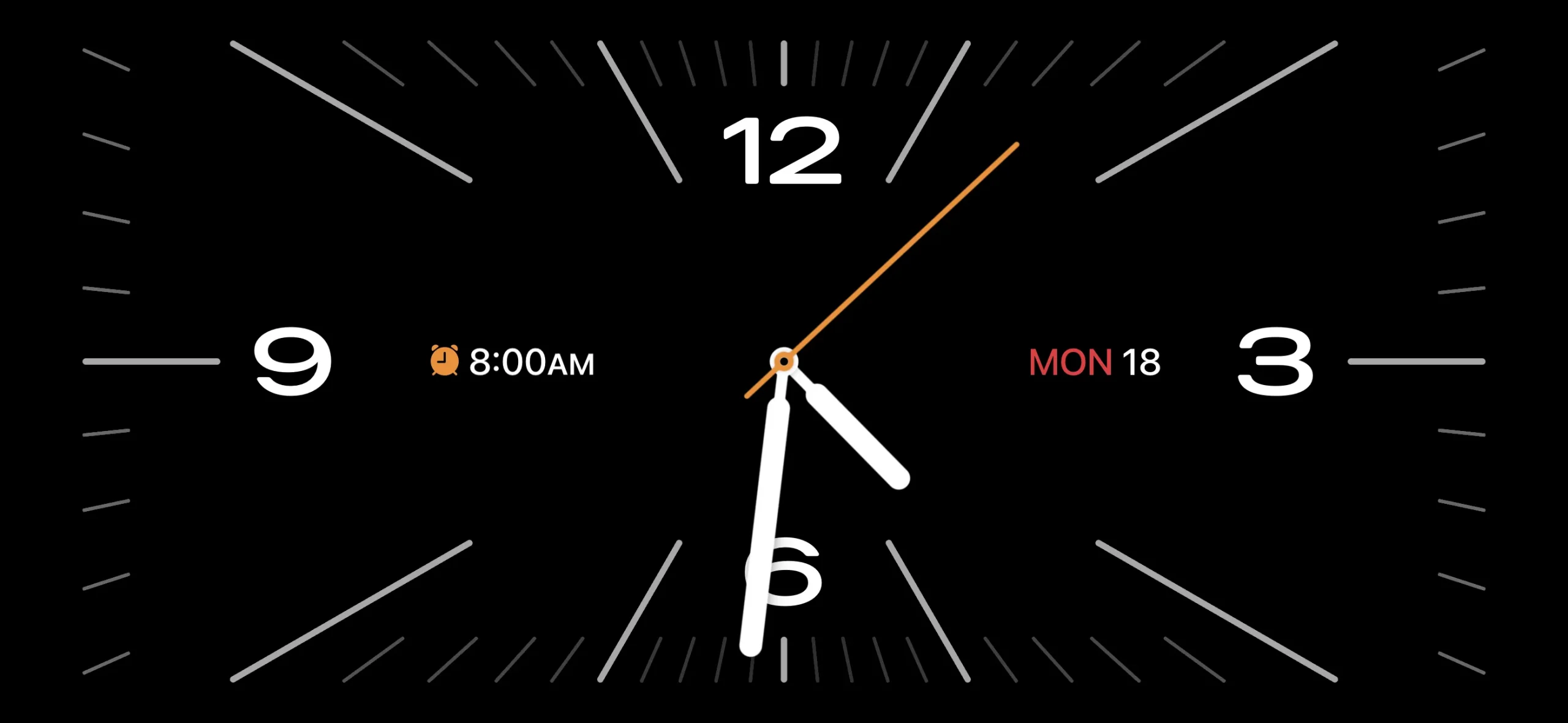
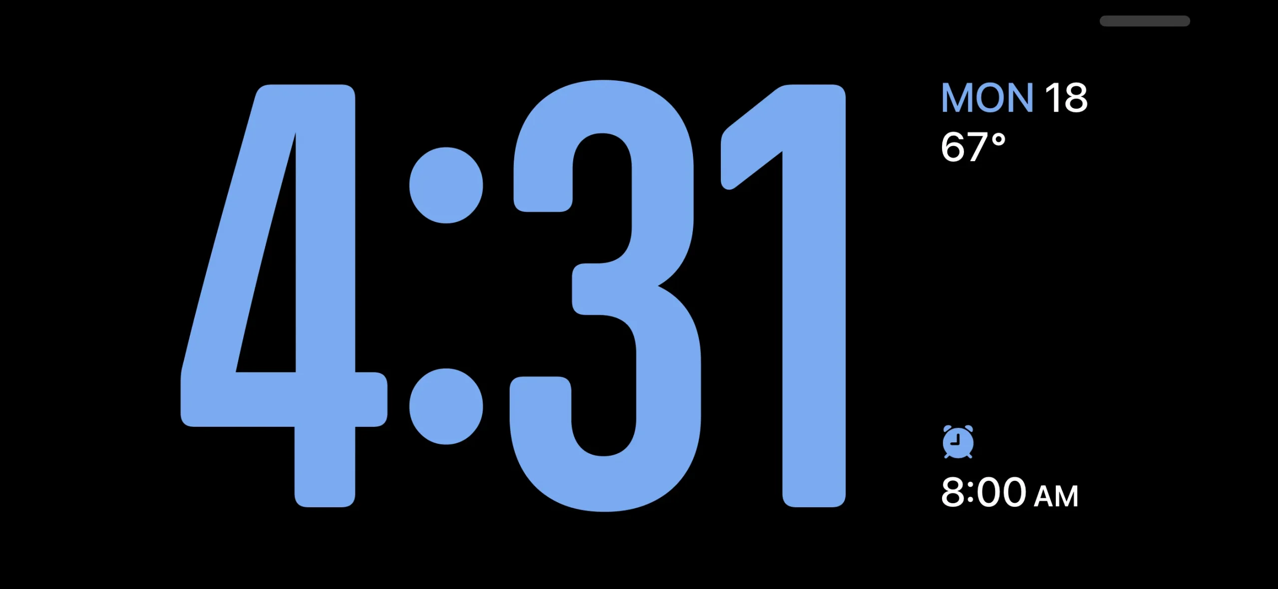
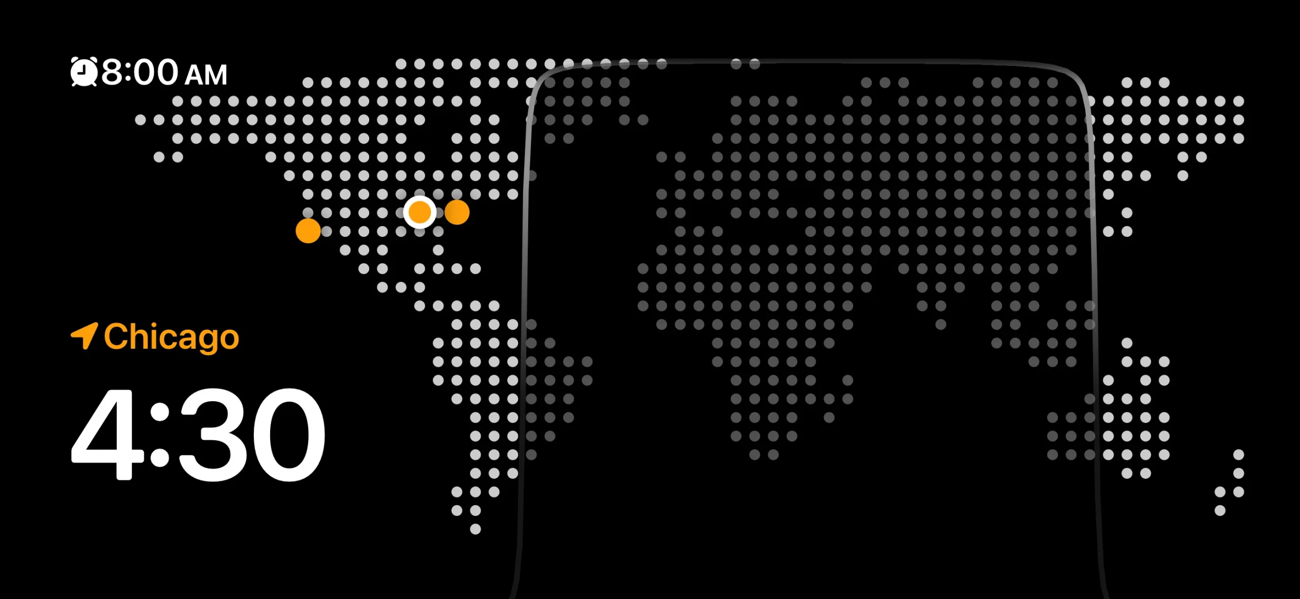
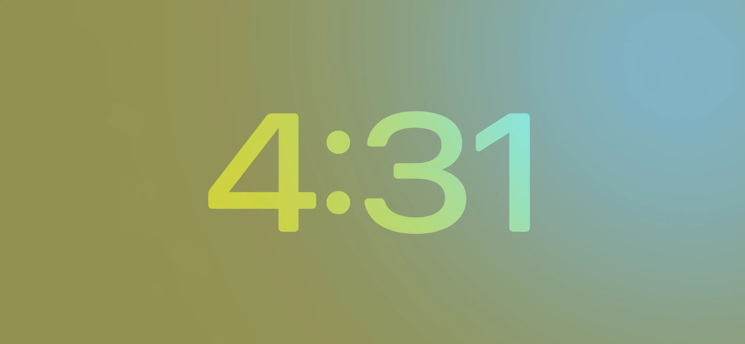
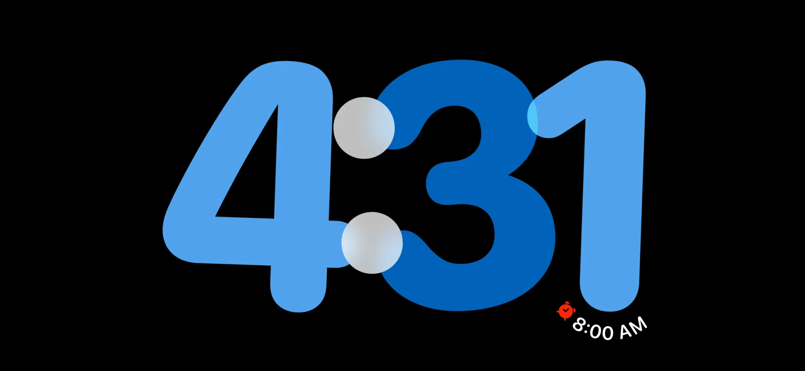
Lastly, there’s a full-screen clock that comes in five swipeable styles: Analog, Digital, World, Solar, and Float. These clocks look great, and I have a feeling many people who use StandBy will just opt for these instead of the more involved pages.
