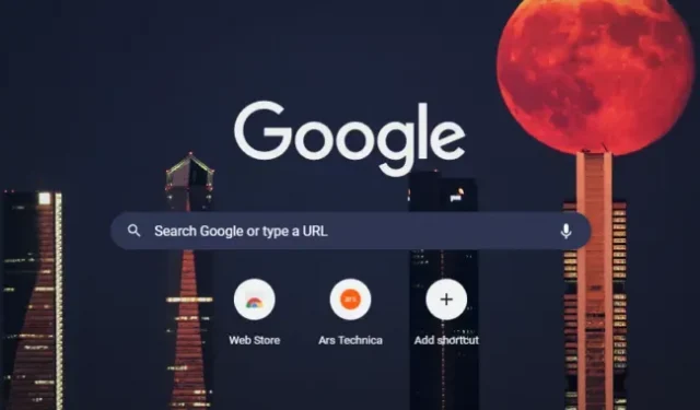
It looks like the start of Google’s color-changing “Material You”design language is finally coming to Chrome, at least in canary builds. Redditor Leopeva64-2 has spotted new flags in the latest nightly builds that automatically recolor the Chrome UI depending on which wallpaper you choose, just like in Android.
If you want to try it right now, you need to grab yourself a copy of Chrome Canary and enable two flags (paste them in the address bar): “chrome://flags/#customize-chrome-color-extraction, “and “chrome:// flags/#ntp-comprehensive-theming”. Once enabled, selecting a Chrome wallpaper using the “Customize”button at the bottom right of the new tab page will also change the color of the tab bar. Another flag in “chrome://flags/#ntp-comprehensive-theming”will also apply those colors to the search bar in the new tab.
Material You launched in 2021 with Android 12. In addition to a new set of size and shape recommendations for UI components, Material You also comes with an automatic color system. Android can automatically extract colors from your wallpaper and apply them to the user interface using a variety of magical algorithms to ensure there are no contrast issues. It works great if you like a colorful user interface and gives Android a unique look.
When Google announced Material You, the company’s vice president of design, Matias Duarte, indicated that the new design language would eventually spread to “the web, Chrome OS, wearables, smart displays, and all Google products.”We’ve since seen desktop Gmail take on a more colorful user interface, but the Material You color system hasn’t been seen outside of Android.

I don’t know if it’s right now to call the color scheme Chrome Material You, as the colors are much bolder and more distracting than what Android typically uses. Android makes a lot of light pastels out of your wallpaper, adjusting the brightness values to maintain readable contrast and match Google’s design intent. The result is usually only a lightly colored background with bolder colors reserved for important action buttons. Chrome is in a far different direction now, with blindingly bright background colors that are likely distracting when you’re trying to focus on a web page. Chrome has had a manual color picker for a while now, so even if it becomes the default, you can probably disable it.
This is the first version of Material You, so colors may be toned down in the future, and some contrast issues (especially with the white Google logo) will be fixed. Chrome’s settings don’t yet use Material You’s proprietary color scheme, but Chrome is clearly moving in that direction. In June, Chrome OS added a commit for “a unified switcher for the next launch of ChromeOS Material Next.””Material Next”is the internal name of Material You. Looks like Chrome is eventually gearing up for a big redesign.


