
If you’re anything like me, you use the Calculator app on your iPhone about fifty times a day and you’re fed up with the same user experience it’s had since iOS 11. Although you can’t change shapes and sizes buttons, there is a way to breathe new life into your calculations with some calculator themes.
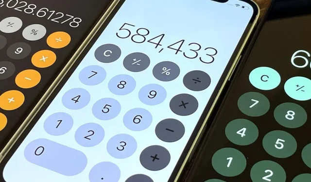
By default, the Calculator has a black background, dark gray keyboard, light gray and orange modifier keys, and white input/result text. And it stays the same whether you use dark mode or not. Heck, even Smart Invert, Dark Mode’s big brother, won’t affect how Calculator looks on your iPhone.
But there is another way to change the Apple Calculator color scheme. In fact, there are several ways, depending on what kind of results you want to get. First, there is Classic Invert, which inverts colors. In addition, there are color filters that give you more control over the color scheme of the calculator’s user interface. There are also scaling filters that use grayscale, inverted, and low-light images.
The best part about customizing the calculator with your own colors is that it won’t apply to the whole device with some themes. If you know anything about classic invert or color filters, it’s that they affect the whole screen until they are turned off. But with the Shortcuts app, you can automate it so that your color scheme automatically turns on whenever you open the calculator and then turns off when you exit it.
Automatic calculator color change
In iOS 14 or later, you can automate some color schemes so that they turn on every time you open the calculator, and then turn off when you exit it. Before we know which ones you can use, let’s go over the general process you’ll use to automate your new look:
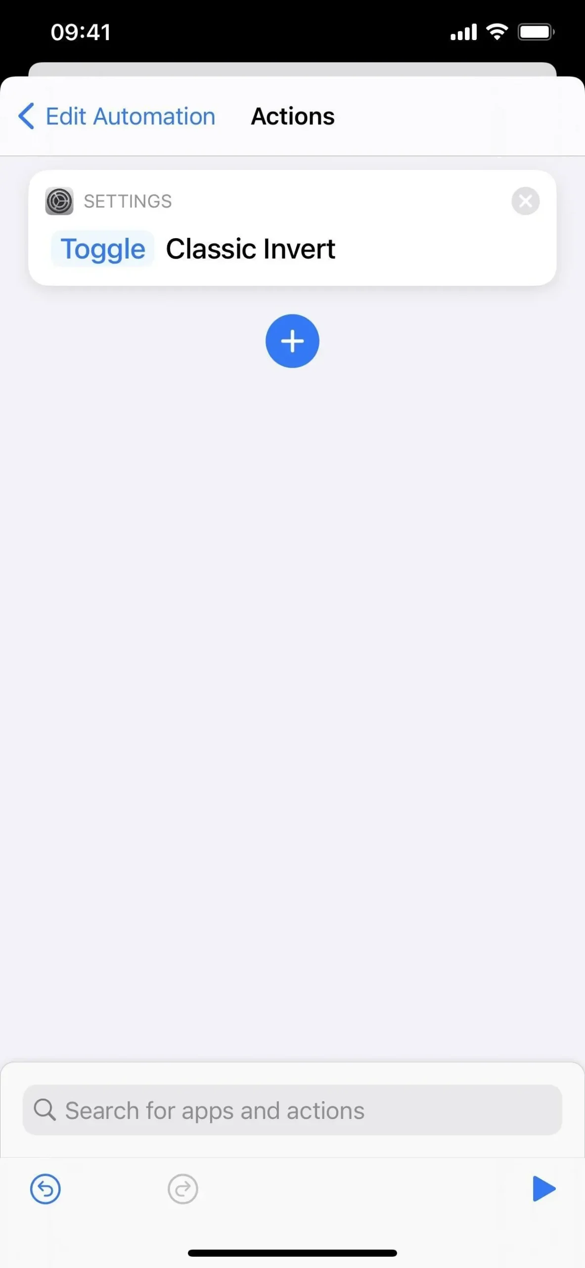
- Open shortcuts.
- Open the Automation tab.
- Select “Create Personal Automation”(you may have to click the plus icon first).
- Select Application.
- Click “Select”next to the application.
- Find and select Calculator.
- Click Done.
- Leave the “Open”box checked and also check “Closed”.
- Click next.
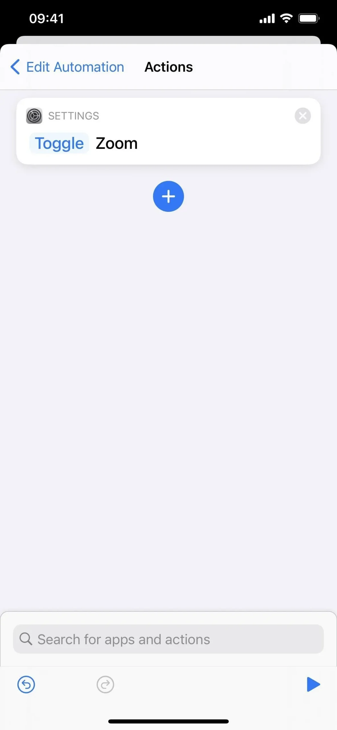
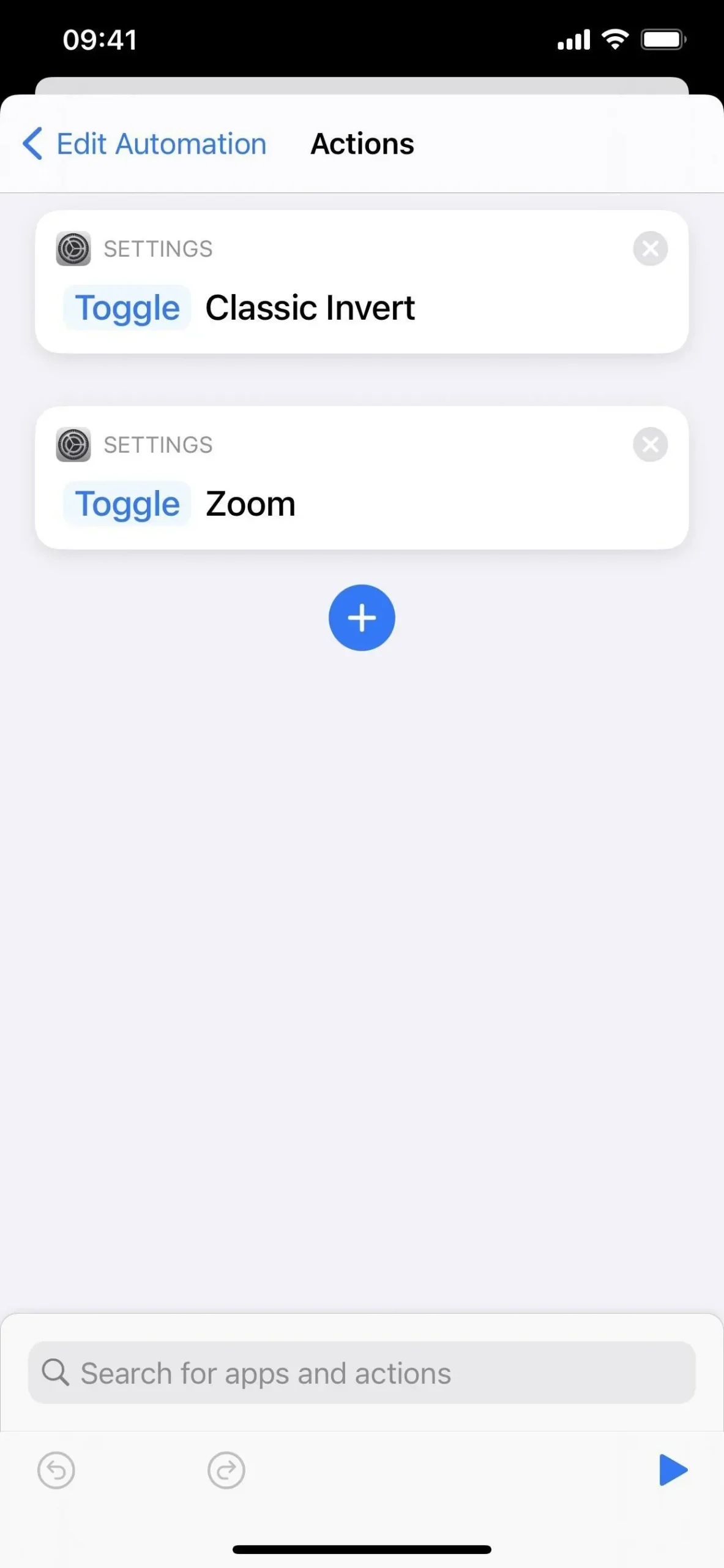
- Add the appropriate action or actions (see options below).
- Click “Rotate”and choose “Toggle”for each action instead.
- Click next.
- Turn off the “Ask before launch”toggle.
- Click “Don’t Ask”to confirm.
- Click Done.
Colors that work with automation
Not all color options work with the automation described above, but many of them do, and you can combine them to further customize how the colors of the calculator’s interface look.
Option 1: install a classic inverter
Classic Invert changes the appearance to an inverted color scheme, i.e. all colors are turned into their opposites. Whites become black, blacks become white, oranges become blue, light grays become dark gray, and dark grays become light gray.

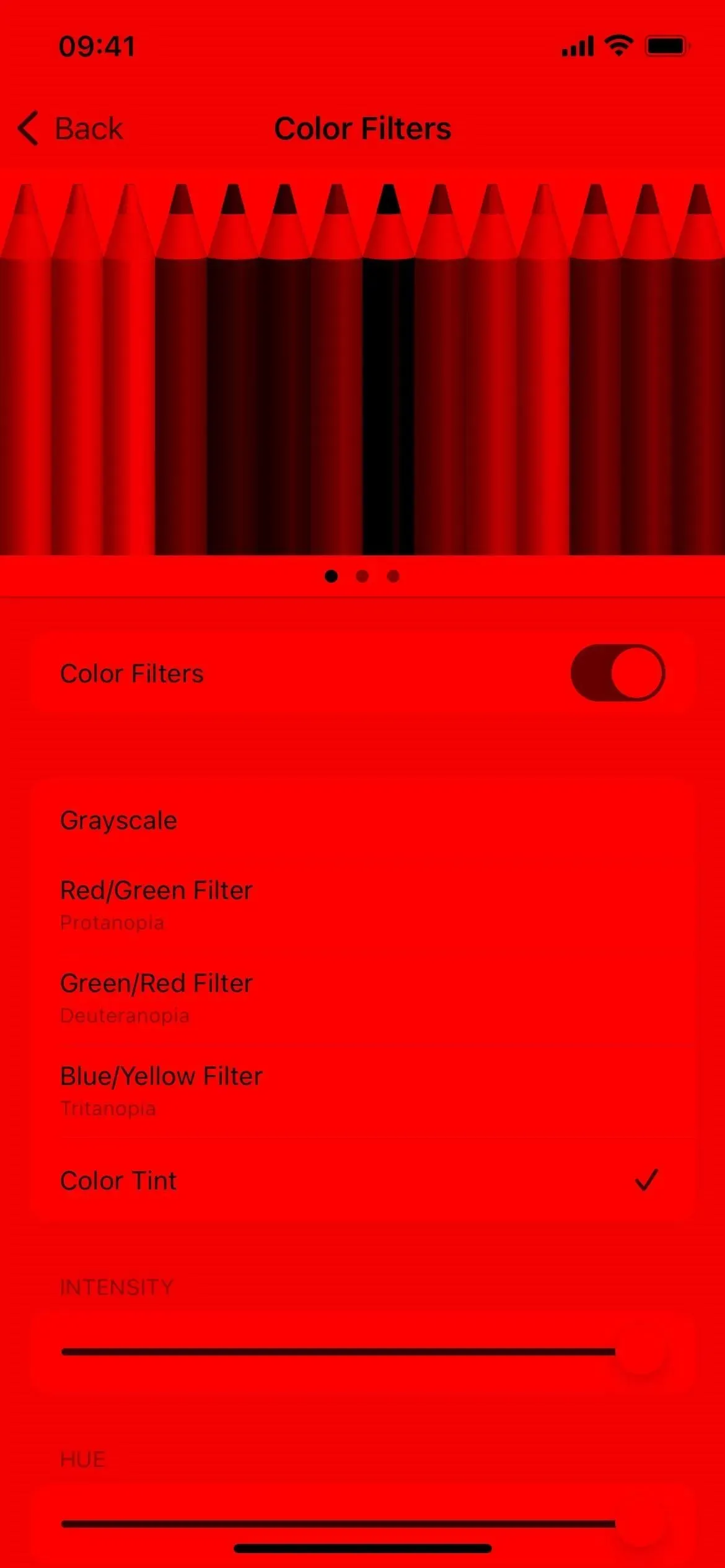
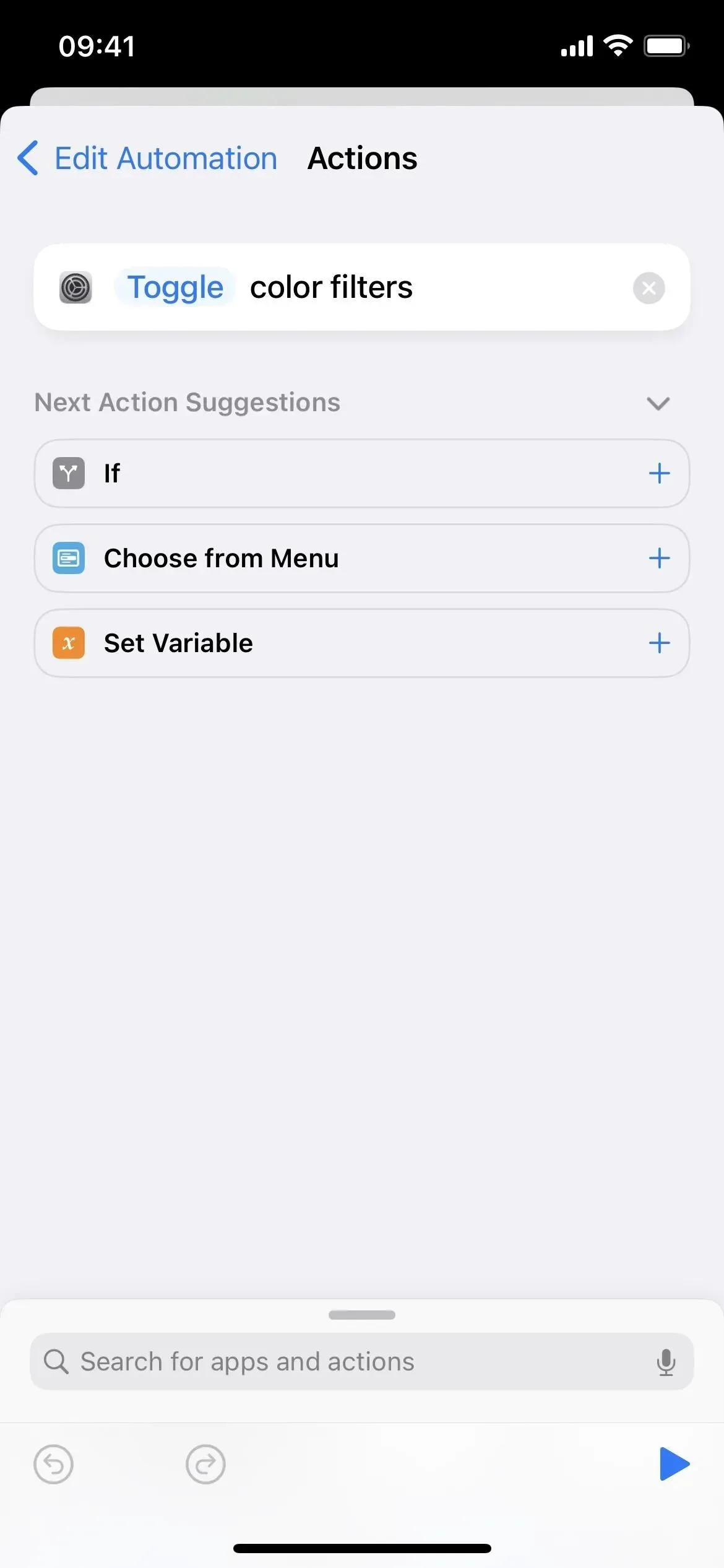
Option 2: Install color filters
Color filters are designed for people who are colorblind or have trouble seeing or distinguishing certain things on the screen, but anyone can use them. This is a step up from the scaling filters (options 4-6 below) and gives you more freedom.
The only problem is that you have to use iOS 16 to toggle them in shortcut automation. If you’re not running iOS 16 on your iPhone yet, skip to the end of this article for an alternative way to use color filters in the calculator.
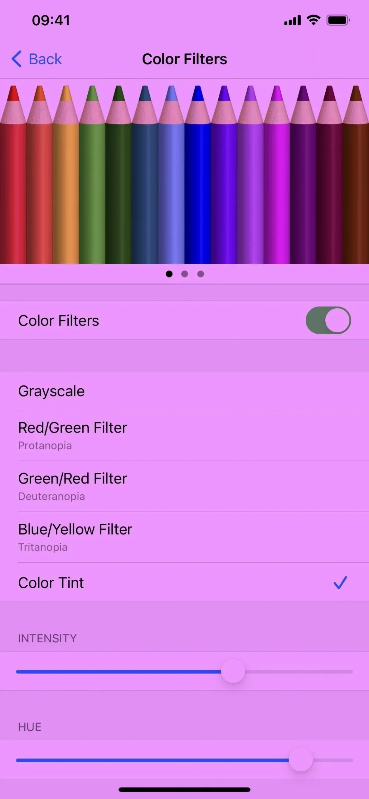
To set the color scheme you want to use in the calculator, you must first pre-set it via Settings -> Accessibility -> Text Display and Size -> Color Filters. Enable this feature and you will see all available filter options.
- Grayscale (you can also use option 5 below for zoomed grayscale)
- Red/Green Filter (Protanopia)
- Green/Red Filter (Deuteranopia)
- Blue/yellow filter (tritanopia)
- Color shade
- Intensity (not available for grayscale)
- Hue (only available for color hue)
Each Protanopia, Deuteranopia, and Tritanopia filter has an intensity slider so you can adjust the color change accordingly. The Hue of Color option has an intensity slider and an additional slider for hue.
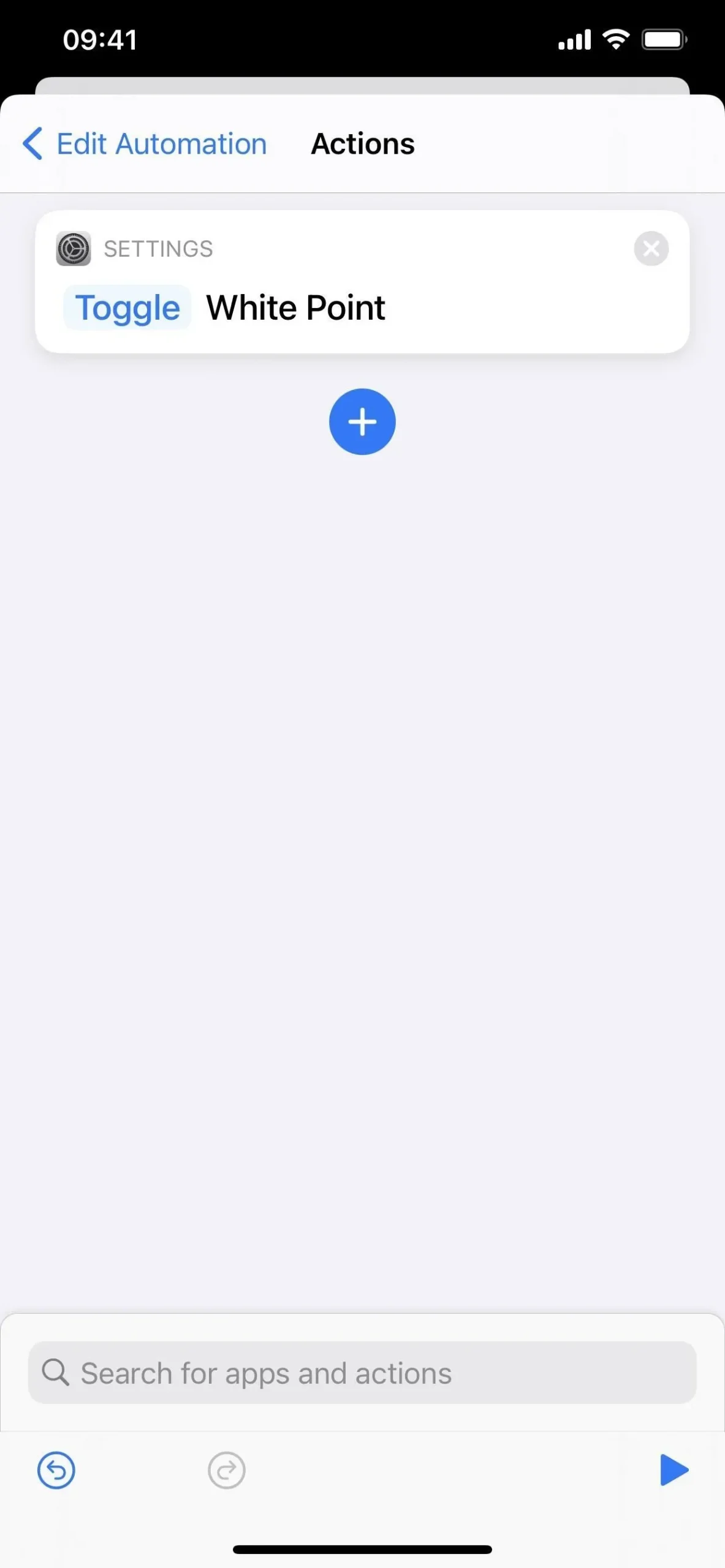
Option 3: Set White Point
White point reduces the intensity of white colors on the screen, but affects the entire display, not just the white parts. This basically reduces all white areas to be less overwhelming, but also reduces the intensity of other colors on the screen to compensate.
Option 4: Set scale (greyscale)
The basic premise of Zoom is what you would expect: it enlarges the screen. However, it has other features that work, and you don’t even need to enlarge the screen to use them.
Scale filters come in four shades, each of which can be preconfigured in Settings -> Accessibility -> Scale -> Scale Filter. In addition, you can change them after activating Zoom from the Zoom menu, accessed by triple-tapping the screen with three fingers; from the menu, select “Select Filter”, then select your poison.
If the screen is enlarged after activating the Zoom function, triple-tap the screen with three fingers to bring up the Zoom menu, then drag the zoom slider all the way to the left. He should remember your choice in the future.
Grayscale turns the calculator into all black, grey, dark gray and white.


Option 5: Set Scale (Grayscale Inverted)
Grayscale inversion also turns the calculator into black, grey, dark gray and white, only the colors are inverted. The biggest change you’ll notice is that the background is now white instead of black.


Option 6: Set Zoom (Low Light)
Low Light works similar to the White Point option above, so you won’t notice much difference in the calculator when comparing the two.


Option 7: combine any of them
Any of the above options can be combined to get a different look, although only some of them will make sense. For example, when using Classic Invert and a Low Light filter, all colors are inverted and then a Low Light filter is applied to make everything look washed out.

There are other options, but they don’t affect the Calculator much. The inverted filter in Zoom is the same as the classic invert, but you can use it in place of the classic invert if you like. There’s also a “Set Contrast Increase”, but you won’t notice anything even with the other color options turned on. As I said, “Set Light/Dark Mode”and “Set Smart Invert”have no effect.
Using color filters in iOS 15 and earlier
As mentioned above, the Set Color Filters action is only available in iOS 16. If you’re using iOS 15 or earlier and want to use color filters for the Theme Calculator, you’ll need to enable them when you open the app. then disable them on exit.
The easiest way to manually enable/disable color filters is to use the “Ease of Access Shortcut”in the “Accessibility”settings. Then you just triple-click the side or home button to activate it in Calculator, and then do it again when you exit Calculator (unless you want to leave it enabled for other apps).
To select a color scheme, go to Settings -> Accessibility -> Text Display & Size -> Color Filters. Enable this feature and you will see all available filter options. There are grayscales that you can implement using one of the automated methods above, so you don’t have to worry.
Each Protanopia, Deuteranopia, and Tritanopia filter has an intensity slider so you can adjust the color change accordingly. The Hue of Color option has an intensity slider and an additional slider for hue.
Play around to see what works best for you
You probably won’t know which look to choose if you don’t experiment. So it’s worth trying all of the above options to see which one works best for you.
It’s nice that Apple has added “Set Color Filters”to the list of available Shortcuts actions in iOS 16 and enabled “Color Filters”as a “Back”option in iOS 15. That said, we hope we get even more features for further customize the colors and themes of the iPhone apps.