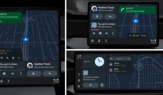
Android Auto, Google’s car interface for Android, is getting a new, more flexible design on Google I/O. Previously, Android Auto required a fairly rigid screen aspect ratio. It couldn’t handle things like large vertically oriented car screens and often resorted to a pillar box or UI letterbox to keep the layout reasonable. Google now says the interface is “built to adapt to any screen size”thanks to a new panel design.
Google says that “there are three main features that drivers prioritize in their cars: navigation, media, and connectivity,”and Android Auto’s new design puts each of those interfaces in its own panel. The maps are getting the biggest, the main panel, media and communication panels sit next to each other, and there is also a combined status/navigation panel. To accommodate millions of different screen sizes, these elements can be positioned in any orientation that best suits the vehicle.
One example, close to the current Android Auto configuration, shows a combo bar oriented vertically along the edge of the screen, followed by a vertical stack of message and media bars, and then a large Google Maps bar. Another example of a more vertical screen design shows a large Google Maps bar on top of the message bar and media bars, with a list bar at the bottom where everything can be arranged by size.
The new interface will be released “this summer”.


