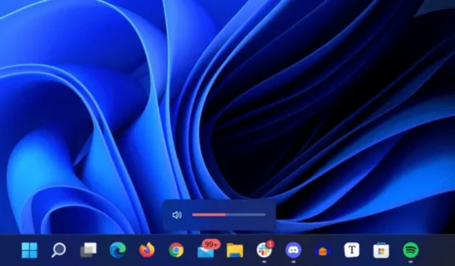
Improving the visual and functional consistency of Windows 11 is becoming a top priority for Microsoft this year, as evidenced by ongoing updates to core apps such as Notepad, Paint, and Media Player, as well as ongoing efforts to bring advanced settings over from older Windows 7-era control panels. and in the modern Settings app. Also in focus was restoring some of the flexibility to redesigned areas of the OS, such as the Start menu and the taskbar.
The latest Windows 11 Insider build released to Dev channel users continues this work by updating the overlays for volume, brightness, and other settings to match the more rounded look of Windows 11. New indicators appear in the lower center of the screen, rather than in the upper left corner, they will respect your light or dark mode settings, and like the start menu and taskbar, they use the Mica style to match the color of your desktop wallpaper.
The other changes in this preview build are quite small; “Apps and features”in the Windows + X context menu has been renamed to “Installed apps”, the Voice Accessibility feature can be pinned to the taskbar and Start menu, and the Clock app can be uninstalled. Exciting times!
We don’t know when the changes that are currently being tested on the Dev channel will be made available to the general public – Microsoft has released some tweaks as part of smaller Windows updates, and many app updates are now coming through the Microsoft Store. Others may have to wait until the first major service update for Windows 11 version 22H2, which will be released later this year.


