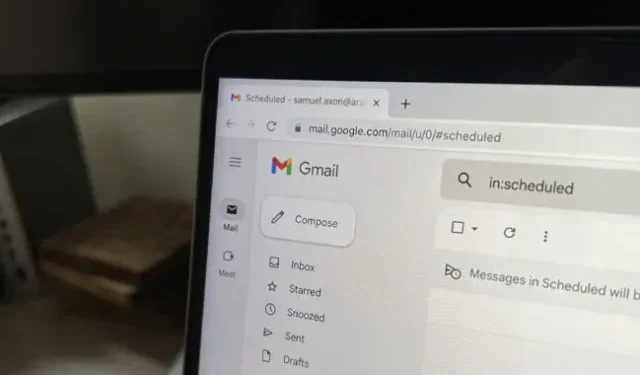
Starting this month, users who opted out of the new Gmail design introduced earlier this year will be forced to switch to it.
The latest design was first introduced as a subscription upgrade back in February before being abandoned this summer. It’s just Gmail now, period.
The design didn’t change how Gmail itself works much; basically it just changed the color scheme – Gmail’s red branding went away in favor of a more neutral and bluish default look, in line with Material You’s design principles. In any case, you can change the coloring yourself.
The most notable change in the new design is the addition of a second sidebar on the far left of the screen next to the regular Gmail sidebar; it includes things like your inbox and labels. An additional sidebar was Google’s attempt to promote Chat, Spaces and Meet, products the company created to compete with Slack and Zoom in the virtual office world. By default, the panel had links to Gmail, Chat, Spaces, and Meet… and a lot of unused free space.
Google said this sidebar was introduced to make it easier to navigate between these apps without having to switch between browser tabs, but this was more of a publicity stunt as these services are not as popular as competitors like Slack, Zoom, and Microsoft Teams. available in some companies.
That being said, you can remove the new sidebar entirely if you wish, which was not the case when it was first introduced earlier this year.
In July, Ron Amadeo of Ars Technica wrote about how to get rid of this sidebar:
This new “no sidebar”option isn’t very obvious, but you can disable the Gmail sidebar by disabling Google Chat and Google Meet. Just go to settings, then click the “Settings”link in the “Chat & Meetings”section. Uncheck both boxes and the sidebar will disappear, allowing you to free up a lot of screen space.
This makes the regular Gmail sidebar behave just like the previous design. Whether you stick to the sidebar or not, you can no longer customize chat on the right side of Gmail.
Amadeo also explained how you can customize the background color to make it a little closer to what you knew before:
Gmail still has a theme system, so you can change the color to whatever you want. Click on the settings gear in the top right corner, and then in the “theme”section, click on “view all”. The background closest to the old Gmail is a solid “soft gray”background variant. To really match the old Gmail background, you need “white”, but that’s not an option.
This won’t give you an exact copy of the old look, but it’s pretty close. Of course, if you’re not too worried about the new design, you can just use it – it’s probably more convenient if your organization makes heavy use of Chat or Meet.


