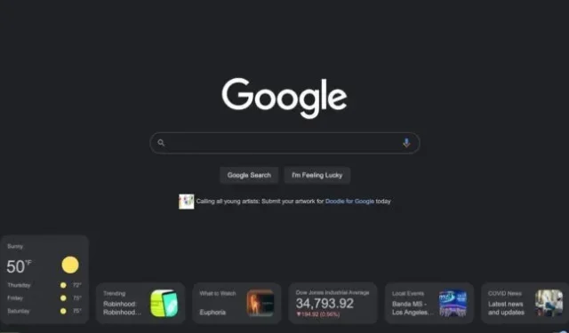

Check out this completely wild Google homepage experiment spotted by 9to5Google: the search page suddenly had a row of cards at the bottom. If this design is widely adopted, it will be the biggest redesign of google.com ever.
In an experiment, Google.com had a row of six cards at the bottom of the page. There’s weather, popular searches, “what to watch”, stock card, local events, and COVID news. Clicking on a card will either expand it or load a search results page. There’s also a “hide content”toggle that disables cards. This all seems very similar to the Google.com app, which has a scrollable list of “discover”cards.
One of the reasons Google search initially became popular was because the search page was simple and easy to use. At the time, competition included search engines such as Yahoo and Alta Vista, which offered users a huge wall of ads and content. Google’s austerity was Google’s main differentiator in its early days, and it’s interesting to see the company getting closer to the Yahoo days, even if it presents a more modern take on the idea.
You have to wonder how many people are actually still using the Google.com search page. If you have a Google browser, Chrome, you will almost never see it. Chrome’s “new tab”page is similar to Google.com, but it’s not the same, and the prevalence of address bars that are duplicated as search bars makes the search home page look rather dated. So far, there’s no sign that Google plans to release the redesign as a permanent feature, but the company seems poised to make big changes to search as of late. Dark mode (shown in the screenshot) has only been around for five months.